I’ve been building websites for a while now. I know the principles. I know the psychology. I know what should work.
But knowing and doing are two different things. I’ll explain what I learned about trust by testing colors & text on my own website.
A while back, I decided to run some experiments on my own site. Nothing fancy. Just small changes—one at a time—to see what actually made a difference. And honestly? Some of what I learned surprised me.
The Button That Changed Everything
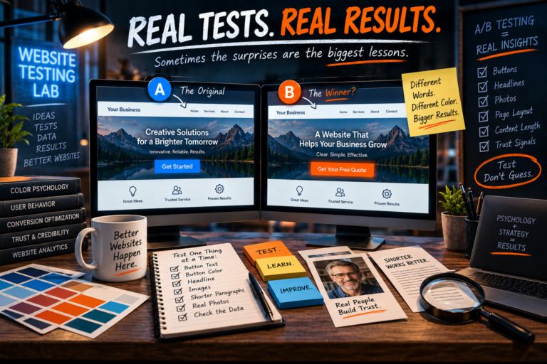
I had a call-to-action button on my homepage. It was blue. It said “Get Started.” Pretty standard stuff.
Then I changed the text to “Get Your Free Quote.”
Clicks went up.
Then I changed the color from blue to orange.
Clicks went up again.
I didn’t change the design. I didn’t change the offer. I just changed a few words and a color. And suddenly, more people were taking action. What changed? It wasn’t the color. It wasn’t the words. It was the feeling. People were less hesitant. The language was friendlier. The button was more obvious. People had less anxiety about clicking.
The Headline That Nobody Read
I used to have a clever headline on my homepage. It was witty. It was memorable.
And it was a failure.
The data showed that people weren’t reading it. They were scanning right past it. Because people don’t want clever. They want clarity. They want to know if your website can help them, fast.
If your headline doesn’t immediately tell people what you do and why it matters, it’s not a headline. It’s an obstacle.
The Photo That Made People Trust Me
I used to use a generic photo on my About page. Professional, but generic. It looked like every other website on the internet.
Then I switched to a real photo of myself.
And I noticed something interesting. People stayed on the page longer. They read the text more carefully. They commented on the photo.
Real photos build trust. Not because they’re better quality—but because they’re authentic. They show a real person. And people want to do business with real people.
The Paragraph That Was Too Long
I used to write long, detailed paragraphs. I assumed people wanted to know everything. But they don’t. They’re busy, they’re distracted, and they want what they want as fast as possible.
So I cut. And cut. And cut. And what happened? People actually read the content.
If you’re trying to help visitors make a decision, short paragraphs are the key. Structure, not length, is what matters.
The “About” Page That Actually Converts
You might think the “About” page is just a boring formality. But on my site, it’s one of the most visited pages, and it plays a key role in the customer journey.
Why? Because people want to know who they’re doing business with.
It wasn’t just about a great story. It included a specific statement about how the business served customers. That was the turning point for many people.
The “What’s This?” Moment
There were a few tweaks that worked because they were a little different. The important thing was being clear about what they did and what you’d get.
One time, I tested a few different headlines. The most boring one won. That’s telling.
What I learned: something that’s standard is something people trust. They’re comfortable with it. They know how to use it. And comfort leads to conversion.
What I Learned
Here’s what all of this taught me:
- Small changes can have a huge impact. Moving a button, simplifying a headline, adding a line of text—these aren’t big investments, but they can transform your site’s performance.
- You’re not your user. What makes sense to you doesn’t make sense to everyone else.
- Trust is built in small moments. A photo, a headline, a color choice—these aren’t just design decisions. They’re trust decisions.
- Test everything. If you’re not testing, you’re guessing. And guessing is a terrible business strategy.
The Bottom Line
I still test things on my site. I still make changes. I still pay attention to what works and what doesn’t. Because the best way to improve your website is to pay attention to how people actually use it.
If you’re not doing that yet, start today. You might be surprised by what you find.
And if you’re not sure where to start—or if you’d rather not spend hours wrestling with tests—I can help. Because the goal isn’t just to have a website. It’s to have a website that actually works.
This is the final post in our series on the psychology of web design. Check out the rest of the series: