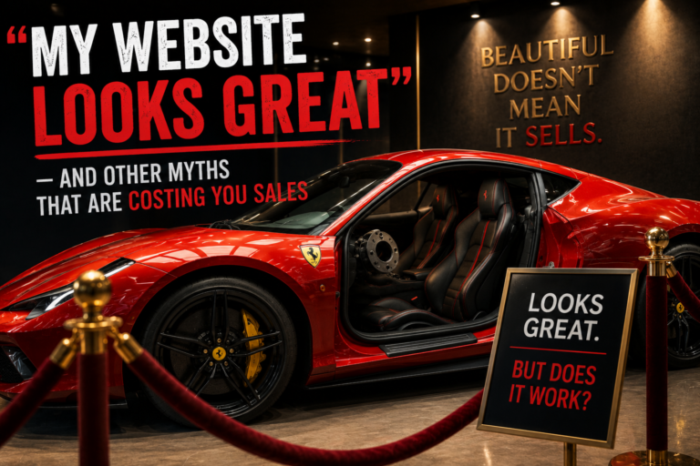
I have often been asked a question similar to this;
“My website looks great. I’m happy with it. Why isn’t it bringing in leads?”
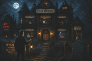
Here’s the hard truth: a “great-looking” website doesn’t always work. In fact, sometimes it’s the opposite. A site that looks beautiful can still perform terribly.
Because beauty isn’t the same as effectiveness.
Let’s bust five myths that are costing you sales, and give you something useful to do instead.
Myth #1: “Good Design Is Just About Looking Good”
This one’s the big one. The one that gets people into trouble.
We all want a website that looks good. There’s nothing wrong with that. But good design isn’t just about aesthetics. It’s about function. It’s about clarity. It’s about persuasion.
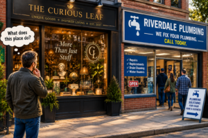
If your site looks great but nobody can figure out what you do or how to buy from you, it’s failing.
The fix: Ask yourself: “Does this design help people take action?” If the answer is no, it’s not good design, it’s just decoration.
Myth #2: “I Know My Customers, So I Don’t Need Data”
I get it. You’ve been in business for years. You know your customers by name. You know what they want.
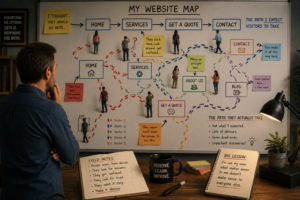
But here’s the thing: you don’t know how they interact with your website. You don’t know which pages they visit, how long they stay, or where they drop off. And you definitely don’t know what they’re thinking when they land on your site.
The fix: Look at your analytics. See where people are spending time. See where they’re leaving. Use that data to make decisions. Your instincts are valuable, but data makes them better.
Myth #3: “More Choices Are Better”
This one feels intuitive. More options mean more ways to buy, right? It’s a common fallacy that offering more variety will attract more customers, but the opposite is often true.
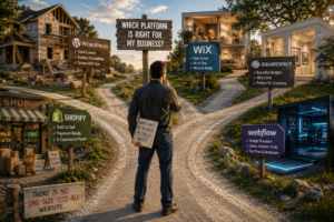
When you give people too many choices, they freeze. They get overwhelmed. They can’t decide. And instead of choosing, they walk away. This is called decision paralysis. It’s real. It’s common. And it’s costing you sales.
The fix: Simplify. Pick one or two things you want people to do on your site. Make those obvious. Remove everything else.
Myth #4: “Social Proof Isn’t That Important”
Some people think testimonials are just fluff. They think, “My work speaks for itself. I don’t need to show off what others think of me.”
But here’s the reality: people are heavily influenced by others. When they see a testimonial, they think: “If this person had a good experience, maybe I will too.”
The fix: Add testimonials to your site. Real ones. With names and photos if possible. This simple, often overlooked element can dramatically improve your conversion rates.
Myth #5: “I Don’t Need to Test Anything”
This one’s dangerous.
People assume their website is fine. They built it, they like it, and they move on. No testing. No tweaking.
But here’s the thing: you don’t know what’s working until you test it. You don’t know if your headline is resonating. You don’t know if your button color is driving clicks. You don’t know if your pricing page is scaring people away.
The fix: Run simple tests. Change one thing at a time. See what happens. You’ll learn more from a single test than from a hundred guesses.
The Bottom Line
Your website can look amazing and still fail. Don’t let that be you.
- Focus on function, not just aesthetics.
- Use data to guide your decisions.
- Simplify choices to reduce decision paralysis.
- Add social proof to build trust.
- Test to see what actually works.
Beauty is great. But effectiveness is better.
This is part of our ongoing series on the psychology of web design. Check out our post on The 4 Psychological Triggers That Make People Click for more practical advice.