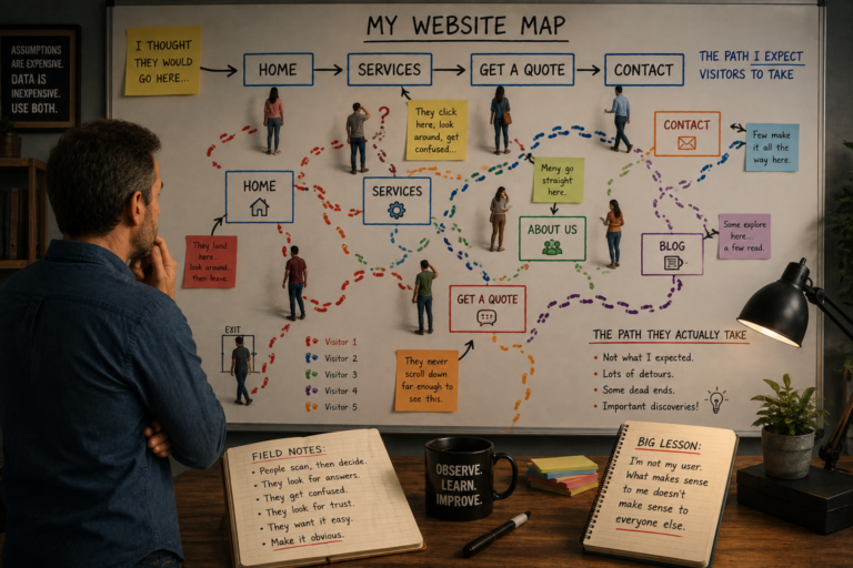
A while back, I decided to do something that felt a little like looking over my own shoulder.
I installed a tool that lets me see how people use my website, where they clicked, how far they scrolled, where they hesitated. It wasn’t about identifying individual users. I have no way to do that, even if I wanted to. It was about understanding behavior.
And honestly? It was humbling.
Because what I thought people were doing on my site and what they were actually doing were two completely different things.
The Contact Form That Nobody Used
I had a beautiful contact form on my site. It was clean. It was simple. It was… completely ignored.
I assumed people would fill it out. Why wouldn’t they? It was right there.
But when I looked at the data, I noticed a pattern. People would click on the “Contact” page. They’d scroll down. They’d look at the form. Then they’d leave.
They never filled it out.
I started asking around. “Why didn’t you fill out the form?” The answer was almost always the same: “I couldn’t tell if you’d actually respond.”
That was a wake-up call. People needed reassurance, a promise that someone was on the other end. So, I added a simple line under the form: “We respond to all inquiries within 24 hours.”
The number of form submissions nearly doubled.
All because I paid attention to what people were actually doing.
The Button That Nobody Could Find
Another thing I noticed: people were looking for something I thought was obvious.
I had a “Services” page that listed everything I offered. But in the data, I saw visitors click around, scroll up and down, and eventually leave. When I followed up, they said: “I couldn’t figure out how to get a quote.”
It turned out that my “Get a Quote” button was buried at the bottom of the page, below a block of text. It wasn’t visible unless you scrolled all the way down.
I moved it to the top of the page. Suddenly, more people were clicking it.
The lesson? What’s obvious to you isn’t obvious to anyone else.
The Homepage That Wasn’t Working
I always thought my homepage was a masterpiece. It had everything: a headline, a photo, a brief description, a call to action. What more could people want?
But when I looked at the data, I saw something interesting. People would land on the homepage, scroll for a few seconds, and then leave. They weren’t clicking anything.
I asked myself: “What are they not seeing? What’s missing?”
The answer was, “They couldn’t figure out who I was and what I did, fast enough.”
So, I simplified the headline. Instead of a clever phrase, I wrote exactly what I did: “Websites for Small Businesses.”
Immediately, people started staying longer and clicking through to other pages.
The “About” Page That People Actually Read
Here’s one that surprised me.
I assumed that the “About” page was a formality. People don’t really read it, right? They just want to see what you do and move on.
Wrong. The data showed people spending a surprising amount of time on my “About” page. They scrolled. They read. They lingered.
They wanted to know who they were doing business with.
That made me rethink the “About” page entirely. It’s not just a placeholder. It’s an opportunity to build trust.
The “Mobile Experience” That Was Painful
I spent most of my time designing my site on a desktop. I’d check it on mobile occasionally, but it always looked fine. No big issues.
Then I looked at the data for mobile users. And I cringed.
Text was too small. Buttons were too close together. People had to pinch and zoom to read anything.
I’d been testing on a brand-new phone with a huge screen. Meanwhile, my visitors were using all kinds of devices. What looked fine on my phone was a struggle on theirs.
I redesigned the mobile experience with that in mind, tested it on older devices, and the complaints stopped.
What I Learned
Here’s what all of this taught me:
- Your assumptions are probably wrong. You think you know what people are doing on your site. You don’t.
- Your customers will tell you exactly what they need. if you’re paying attention. The data is there. You just have to look.
- Small changes can have a huge impact. Moving a button, simplifying a headline, adding a line of text, these aren’t big investments, but they can transform your site’s performance.
- You’re not your user. What makes sense to you doesn’t make sense to everyone else.
The Bottom Line
I still check my analytics regularly. I still ask people what they think. I still pay attention to what’s working and what’s not.
Because the best way to improve your website is to pay attention to how people actually use it.
If you’re not doing that yet, start today. You might be surprised by what you find.
This is the final post in our series on understanding your website analytics. Check out the rest of the series: